
This post is also available in: 日本語
Introduction
I think there is a strong need to organize the data that can be obtained from blogs, media, e-commerce, and other web businesses in an easy-to-understand way and make good use of it.
This post introduces you to Google Data Portal, a free data visualization tool from Google.
Make the most of marketing tools
There are a lot of tools that you can use in the web business marketing.
There’s a free plan for that, and there are tools that are useful.
If you’re interested, please check out our free marketing tools at Utilities.
Google’s Tools Are Free and High Quality
Most of Google’s tools are free, and the quality is high.
Google Analytics is a great way to analyze data.
Google Optimized for AB Testing
What is Google Data Portal?

Google Data Portal is a free data visualization tool from Google.
Also known as Business Intelligence (Business Intelligence) tool.
This is a tool that enables you to summarize and visualize various data such as site inflow information, service usage information, information displayed by search engines, and information on advertisements.
Data visualization tools include tableau and Microloft’s PowerBI, which recently made news of Google’s acquisition.
Originally a service called Google Data Studio
It was originally called Google Data Studio (Google Data Studio), but was renamed Google Data Portal.
What You Can Do with Google Data Portal
All you can do with Google Data Portal is visualize the data, as described above, but here are some use cases.
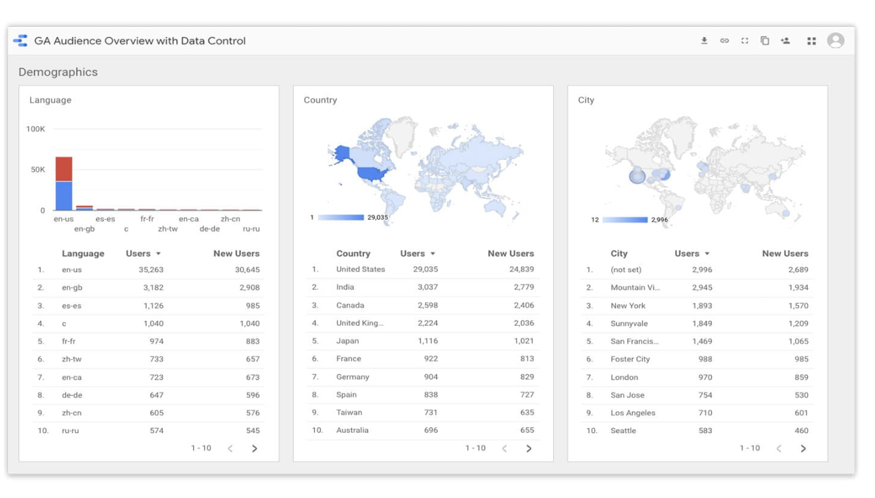
- Google Analytics Visualizes Site Inflow Reports To The Point
- Visualize team progress in a spreadsheet
- Consolidate the results of various advertising
- Sales Management
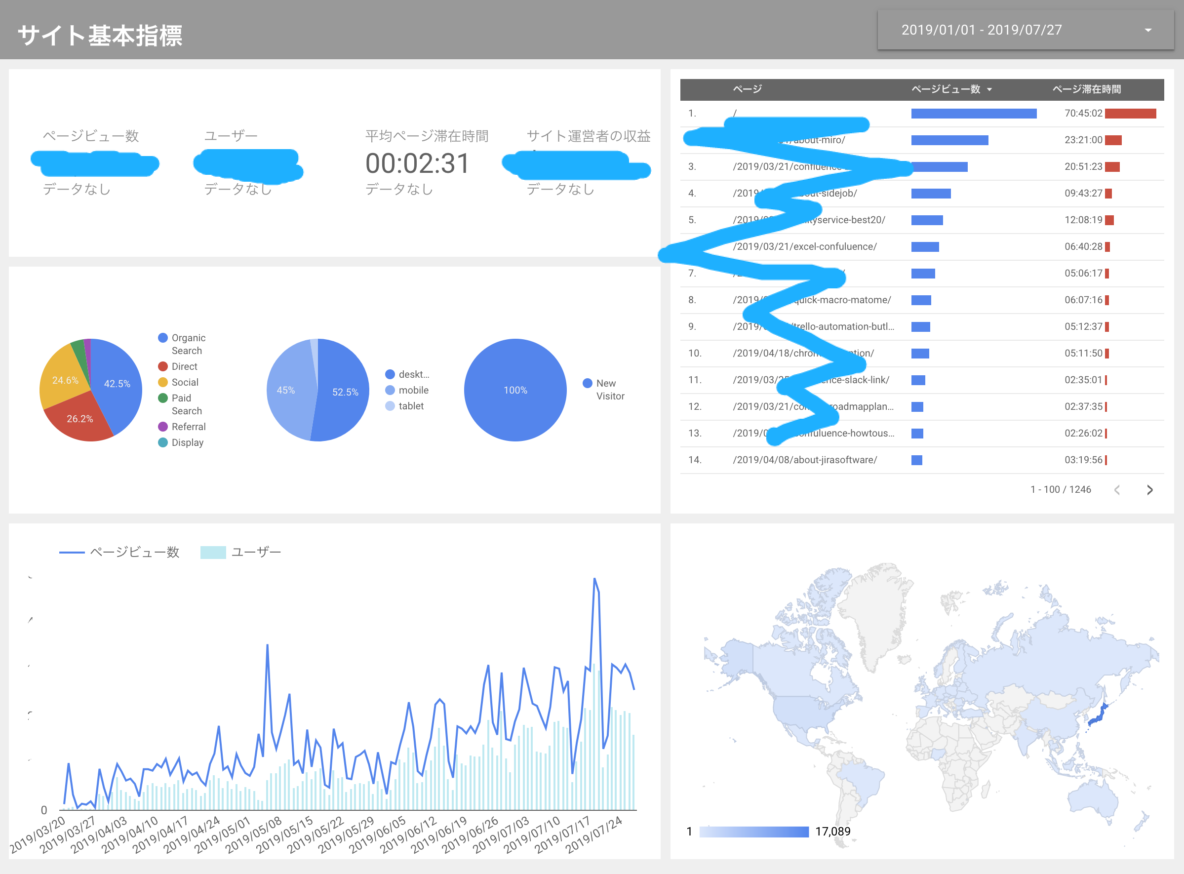
The utility also uses Google Data Portal to check the condition of the site as follows:.
Google Data Portal Features
Let’s take a look at the features of Google Data Portal.
Easy integration with Google services!
This is the biggest benefit, but it’s very easy to integrate data with Google services.
It’s one click away from the hassle.
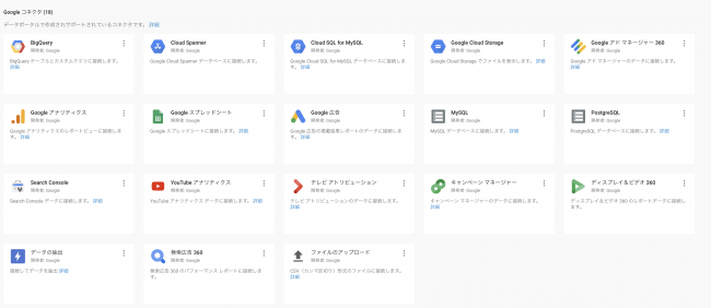
One-click integration with key Google services
- Google Spreadsheets
- Google Analytics
- Google Search Console
- Google Optimization
- Google Advertising
- YouTube
Drag and Drop Graphs
You can make a graph easily by dragging and dropping.

Data acquisition in real time
Basically, whenever you open Google Data Portal, the latest data is always updated.
Easy to share with teammates
Just like Google Spreadsheets, Google Docs, and the like, sharing a link makes it easy for anyone to access the dashboard.
Free!
The biggest advantage is that you can use this quality service for free.
How to register for Google Data Portal
Let me explain how to register for Google Data Portal.
To use Google Data Portal, you must have a Google account.
If you don’t already have a Google account, you can start by creating one.
Visit the Google Data Portal
You can register for Google Data Portal from this landing page.

Using Google Data Portal
Here’s how to use Google Data Portal.
The general steps for using it are:.
- Working with Data Sources
- Create a Dashboard
- Share with your teammates
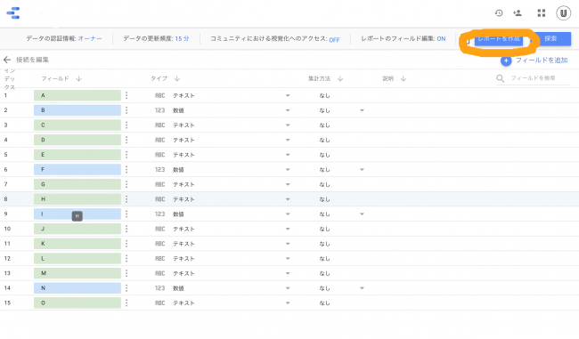
1.Working with Data Sources
The first step is to connect the data, which is the material to be visualized in Google Data Portal.
There is almost nothing troublesome here.
On Your Page, select “Data Source Access”.
Then, the selection screen of accessible data source will appear.

Select any data from the selection screen.
For example, if you want to work with data from a Google spreadsheet, select the spreadsheet you want to visualize the data in, then select the worksheet you want to visualize, and so on.
Click “CONNECTING” in the upper right corner of the screen after making your selection.

This will bring up the list of material data.
When finished, click “Create Report” in the upper right corner.
Blue is numeric data and green is text data.
you will see pop-ups similar to the following:.
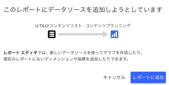
Don’t worry, just click “Add to Report”.
This also occurs when working with other data sources.
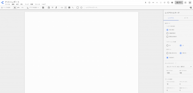
make a report
Once the data source is determined, create a report.
The following screen is the main edit screen.
To test it out, let’s create a graph using the contents of the spreadsheet below.
Let’s make it a pseudo EC raw data.
It is basic raw data showing which date, which user ID, and how many items people bought.

Make extensive use of “Insert”
Click Insert in the top menu to access different visualization methods.
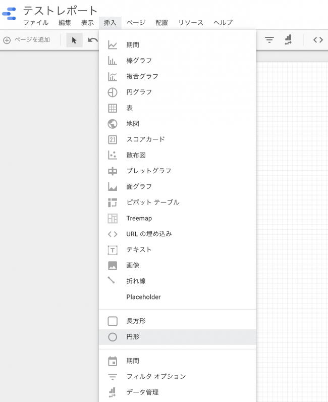
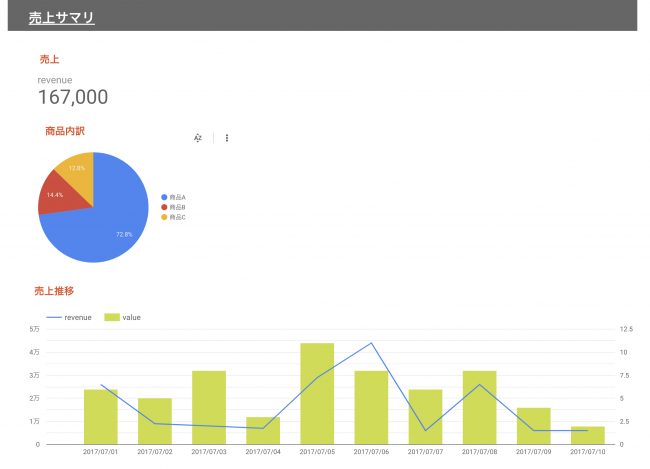
Visualize sales over time
For example, if you want to visualize sales trends over time, click “Period”.
At this point, Google is recommending graphs.
It seems to be recommending user ID changes.
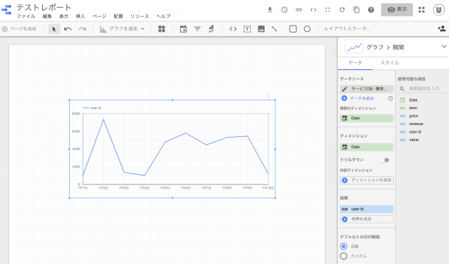
Because dimensions and measures are the points of data organization, they are described briefly.
A dimension is a category of data, and an indicator is a number for which you actually want to know the value.
If you want to represent sales over time, select:.
- Dimension: Date
- Indicator: Revenue
Drag and drop from the right to change dimensions and indicators.
I immediately made a graph of the sales progress.
It’s easy.

If you click on the display such as “Chart” in the right menu, you can select the graph style you like.
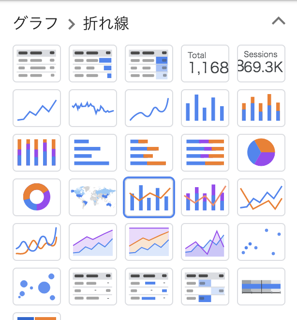
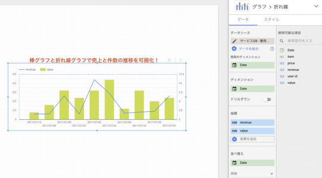
If you want to visualize multiple indicators, you can add them by dragging and dropping them.
For example, if you want to see Revenue and Value over time:.
Try different ways of displaying
Let’s try various ways of displaying it.
For example, with just a few minutes of work, you can create a graph like this:.
It’s very easy.
- Scorecards: view target metrics
- Pie Chart – shows breakdown of metrics
- Transition Graph: View the transition of target indicators
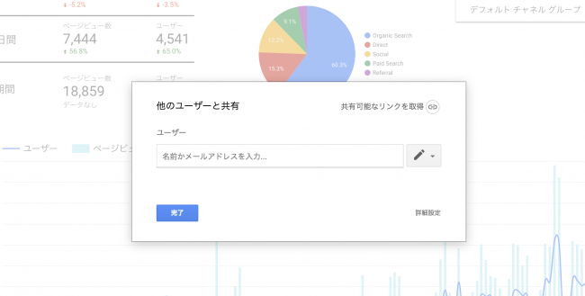
Share your dashboard
Like other Google services, you can share your dashboard with others while setting permissions.
Google Data Portal Sample Report
Because it takes time to create a report from scratch, Google has prepared a sample report in advance.
Let me introduce some of them.
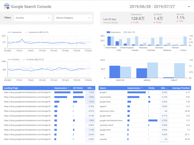
Search Report
A search report using the Google Search Console.
Click “Use Template” to use this template in one go.
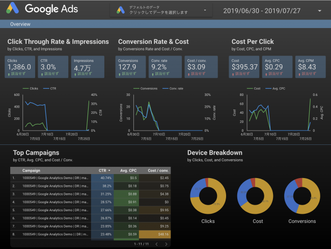
Google Ad Reports
You can also use full-blown ad reports right away.
YouTube channel reports
There are also YouTube channel report templates.
As expected of Google.
You can easily view the performance of your YouTube channel.

And finally,
Here’s how to get started with Google Data Portal.
It may take some time to get used to it at first, but once you touch it, you’ll see how it works.
Google Data Portal is a very user-friendly tool because you can set it up once and use the reports directly.
Utilities offers a range of services to help you be more productive at work.
Check out the article below if you like.